
This week within an online discussion group a person questioned a chart used to illustrate the level of Covid positivity cases within the Hamilton Southeastern Schools. The chart was presented with the indication that the number of positivity cases was flat. Looking at the following image, the red line does indeed look flat in the upper chart:
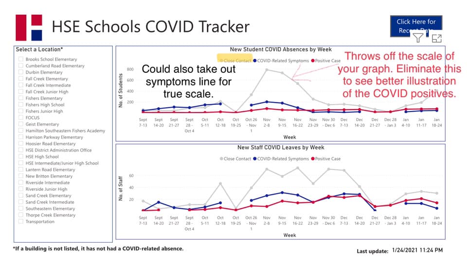
This chart and the message given, highlight how important it is to look closely at the charts, graphs, and other pretty pictures that is given, but also the underlying data. Often it is also important to ask what the objective of the presenter is. Two things to always consider:
- The same data can be presented in many ways.
- Accurate data can be presented without full context.
Let’s consider the first point. If you look at the red line in the upper graph of the image above, it does indeed look flat. A parent at HSE took the same positivity data and graphed it on its own with a scale that wasn’t skewed by the higher numbers presented in the “close contact” data. The result is the following chart:
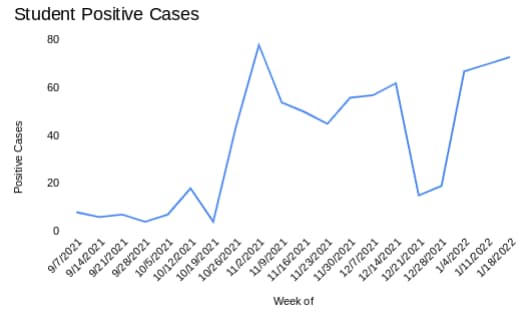
When done more to scale, the differences suddenly become much clearer. Consider a second example that comes from information presented by the Fishers Health Department. The following is the indicator of the current status of the City of Fishers in regard to Covid status:
What is important to notice about this chart is two things. First, it is a cumulative scale thrown into one chart. While this does present the overall status of Fishers, the core status points are not reflected appropriately. This falls into the second point mentioned above, data can be presented without the full context.
The above image also makes a couple of implications. The first is that each color coded stage is equal in size. This is not the case. The second is that the current status is in about the middle of the red category. This is a subjective placement due to the fact that the red category has no top position. In looking at this image, you could assume (wrongly) that if our numbers dropped in half, then we should be in the upper end of the yellow category (Level 2).
The Fishers chart would be better presented in a manner that scales the current status. I don’t have the formula to do the overall formula, so instead I’ll present a charts with the positivity and CI numbers, which are the two most focused on numbers. These are drawn to scale based on the last reported numbers:
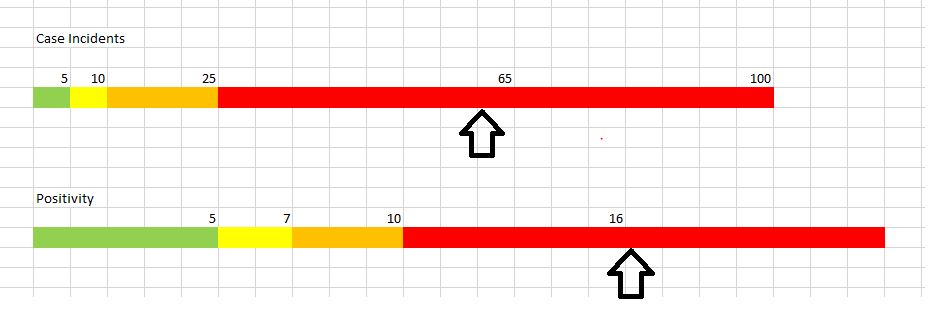
In looking at this graph, it becomes much clearer that if the number dropped by 50%, we wouldn’t be in the yellow area, but rather would still be in red for Case Incidents and orange for Positivity.
Directional Trends and Percentages
A big deal is often made of percentages and directional trends. Both are worth scrutinizing as well.
I once attended a meeting with a major software company where they were promoting the growth of a newer product. They were showing the value and benefits of the product and talking about how fantastic it was doing in the market. Growth was 400%. Impressive!
It was impressive, at least until I asked the crucial question: How many clients had adopted the product? The answer was 16. While they had phenomenal growth of 400%, that adoption was pretty much non-existent. There was no need for further discussion on that product because it seemed that there was no market even with such outstanding growth.
Similarly, downward trends are worth noting. Using the Fishers Covid data, it has been pointed out that we have been in a downward trend for a few weeks. That is a data point being used to indicate that things should be returning to a more normal status. If you look at the current chart presented earlier in this article, you can see that while the trend has been downward (Positivity was over 20% and CI was over 100 at one point), the numbers are still well into the red, critical stage. As such, a decision based on the downward trend does not consider the current status.
If I’m gambling and losing money each bet, that is bad. If I’m losing a little less money each time I bet, that is still bad because I’m still losing money. The fact that I’m losing a little less each time doesn’t negate the fact that money is being lost.
Missing Context
The other key point mentioned above is data being presented without the full context. If you want to see the power of this, watch a contentious news story on television. First watch it on Fox News, then watch it on CNN. I picked these two networks because they are the more popular networks. You’ll find that very different statements can be made by both networks that are true, but missing details.
One example of data with missing context was used this week on the same social media thread that the above HSE charts were used. In this case, a poster commented that 95.5% of people are at work. As such, they made the point that since people could go to work, kids should be able to go to schools in-person too.
While the data point of 95.5% of people being at work might be true (I’ve not verified it, but it sounds reasonable), responders on social media were quick to point out that the use of that data point is the manner it was presented was misleading. While 95.5% of people might be working, many of those working were remote with no plans to go back into their offices in the near future. The fact was, 95.5% of people might be working, but that number in no way reflects the number of people working at offices outside of their homes, which is what the poster implied.
This same problem in data context can be seen when unemployment numbers are presented. The unemployment numbers reported in the news do not reflect the number of people who are out of work and looking for a job. To repeat, unemployment numbers do not reflect the number of people unemployed. Those numbers also do not reflect the number of people who are under-employed. Underemployment, however, is a different topic.
Unemployment numbers are basically the number of people applying for unemployment benefits. Those benefits have time limits in most states. As such, a person that has been unemployed for a long period of time would not be counted. Additionally, people who lose there job, but do not file for unemployment benefits are also not counted. As such, the number of unemployed could be going down while the number of people not employed is going up. You wouldn’t, however, know this if you didn’t understand the context of what the unemployment data actually represents.
Parting Thoughts…
My parting thoughts in this post is to simply reiterate it is important to look at data, charts, and graphs closely and ask yourself not only what the intent of the data is, but also what is the intent of the person presenting the data. If the data was bias, then you need to be careful that you don’t reference the data in a way that is inaccurate and thus decrease your credibility.
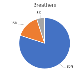
Consider this data point: 80% of the people walking around the planet are breathing.
This data point is absolutely true. You can quote me on this, and I’ll say it is true. Be careful, however, that you don’t add to what I just stated. I said nothing about the other 20%, nor did I use the word “only”.
Data is dangerous and should be used carefully and scrutinized closely.
# # #
It is interesting to note that at the HSE School Board meeting on February 10th, the superintendent provided charts on scales similar to what were covered in this article. He also commented that the could have shown the number of student positive cases against the entire student population of ~22,000 in which case the positive rate would be flat. I wonder if that was a reaction to something I said.